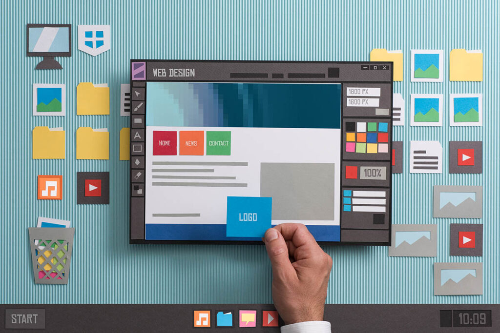
From NeXT Computer to mobiles, websites have evolved tremendously embracing technological advances on the fronts of web design and web development. What looked like a page from a book has now taken the form of an artistic masterpiece with a brilliance of its own. The first website was developed only to share information within an organisation, and the web design factor was entirely overlooked. However, today we are standing at a point where a website must appeal, interest and sometimes lure its visitors to specific sections or actions. Evolution of website design can make up for an interesting thesis, while there have been times that we have gone overboard with eye smashing colours and good for nothing web features, the cult of creative web designers and developers have saved the day with jaw-dropping website designs.
Tracking the evolution of web design
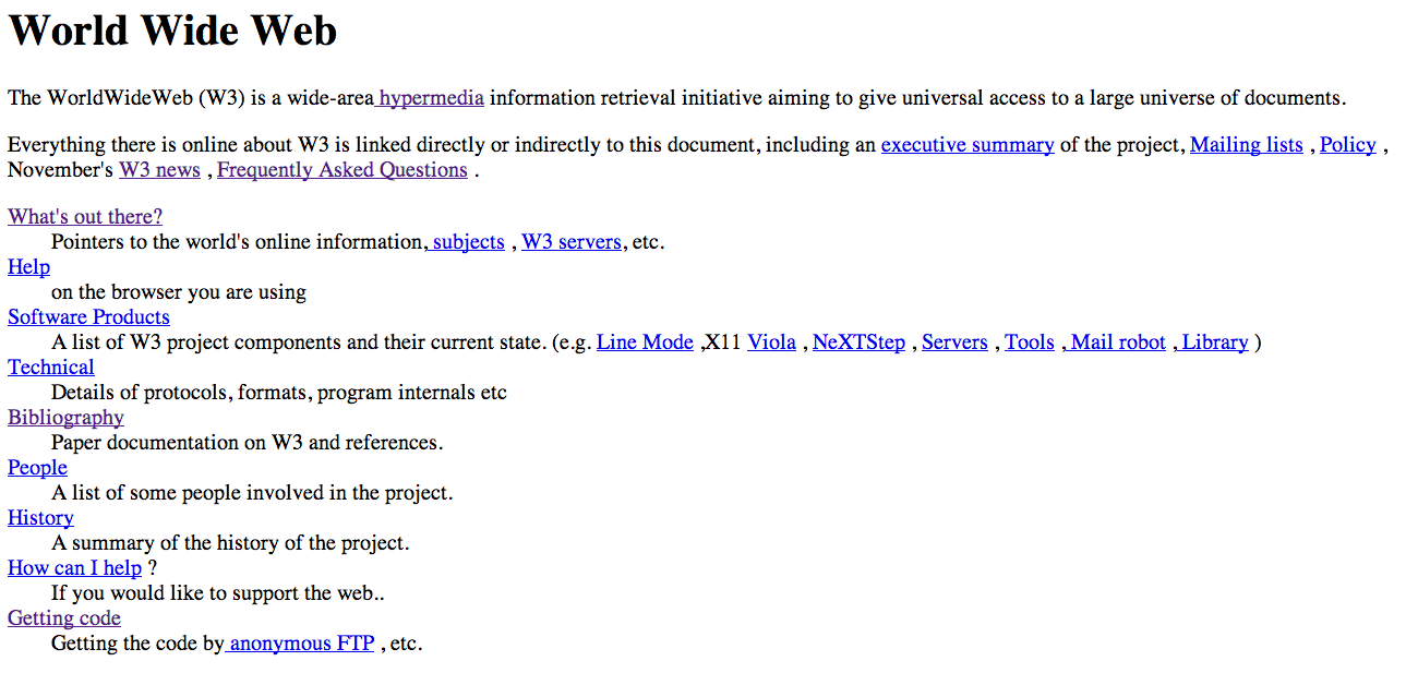
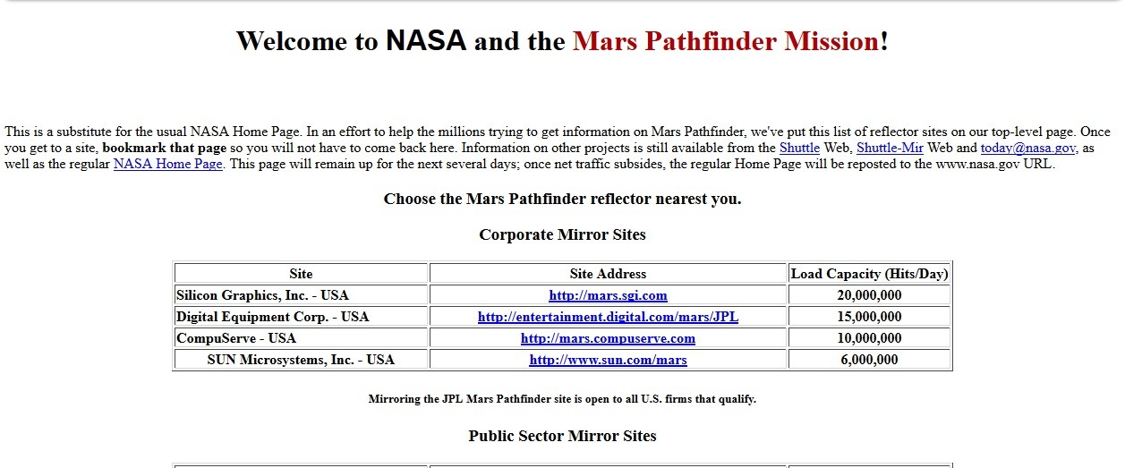
1. www
The first website, World Wide Web, was developed by Berners-Lee, in 1991, which resembled more like a page from a book with only texts and hypertexts throughout the page. This also marked the dawn of HTML era.
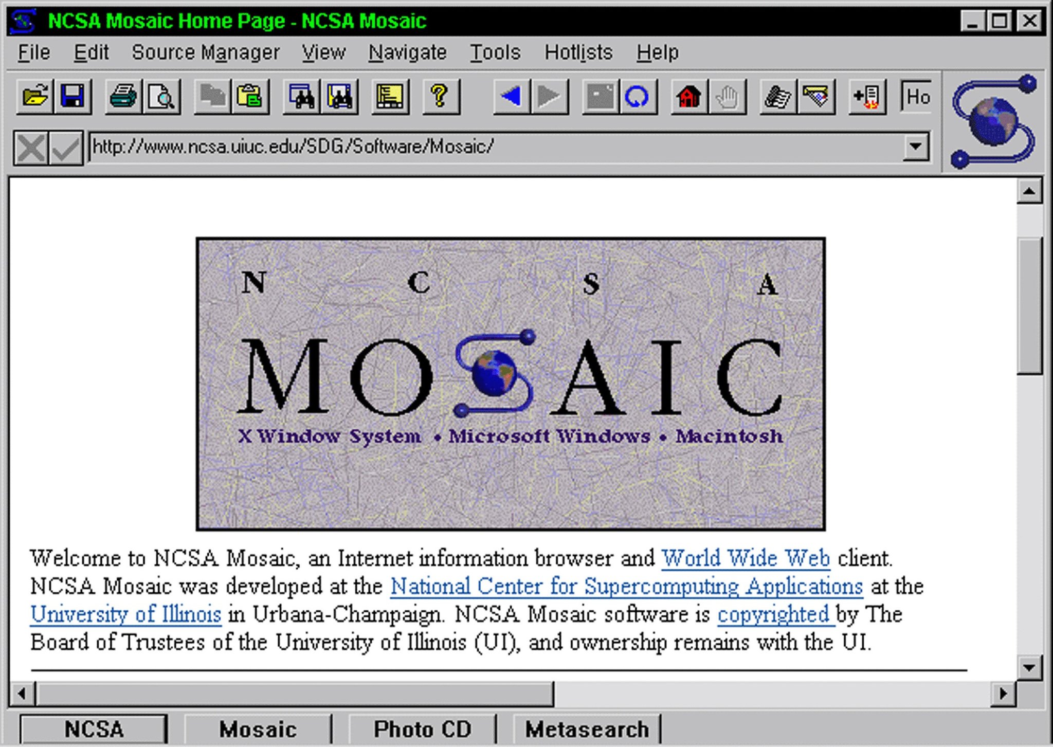
2. Mosaic
In 1993 another browser, Mosaic, was launched which displayed capabilities to break free from the standard format of only text-based web design, by incorporating images.
3. W3C
Tim Berners envisioned the potential of a free World Wide Web and therefore created World Wide Web Consortium (W3C) in 1994 to help the web evolve and remain free from monopoly. Formation of W3C accelerated advancements for the growth of the World Wide Web with faster loading speed at high resolution.
4. Table
Mid-1990’s marked the era of change in website design style with Table style formatting; there was also a surge in the style of fonts and range of colours available at a web designer’s disposal. Sliced images and columns became the dominating concepts of web designing.
5. Flash
Another exciting developments of the mid-90s were the advent of Flash and Website Builders. Websites like Geocities and Angelfire gave the power of designing to everyone who desired or dared to do it on their own and with flash, moving buttons and rolling texts began to appear. Flash dominated for a while as it facilitated visitor interaction within the website design
6. CSS
In 1996 Cascading Style Sheet (CSS) was launched which propelled web designing by allowing designers to experiment with layouts. However, it was CSS2, the successor of CSS, that was a hit. Web designers could now define the colour of backgrounds, font size and layout pattern in the Stylesheet.
7. IE5
In 1999, Internet Explorer 5, the CSS’s most compatible browser, was launched. With this, web designers unleashed their creativity as solid colours gave way to gradients, and the amount of Content used was also brought down.
8. JS
From the year 2000, almost a decade after the first website was launched, web designing and web development witnessed some of the revolutionary changes. In early 2000, with the rise of Javascript, web designers started experimenting with grids, contrasting colours and stationary navigational menu. This took the menu bar to the top of the page, helping visitors scroll down the page and navigate comfortably at their will. Drop-down menu was also introduced, and the range of colours got wider.
9. XML
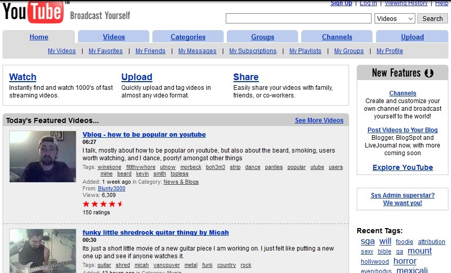
By Mid-2000’s effort was taken to develop processes that further simplified and bettered usability of web designs. Extensible Markup Language (XML), a language that could be understood by both humans and machines, was developed to simplify and speed up web processes over the internet. In 2005, the video streaming giant, Youtube was launched, and web designers started experimenting by incorporating videos into the layout.
10. Safari
In 2008, the first internet browser for mobile, Safari, took form. As a result, two web designs – one for web and one for mobile – were created.
11. Web 2.0
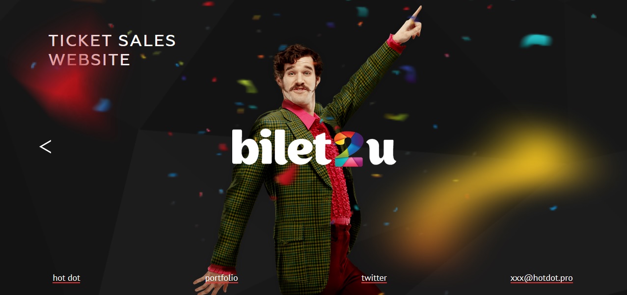
However, towards the end of 2000, the concept of Web 2.0 evolved, incorporating responsive web designs, that worked for different display environments, such as desktops, tablet and mobiles. From there, what followed was just a spell-bounding creative and technological advancement which took user interaction several notches higher. In 2012, the trend of flat designs caught on, which emphasized two-dimensional style that wasn’t flamboyant in nature. Content too came to the forefront engaging and guiding visitors across the website.
12. Parallax
In 2015, another web design concept, parallax was introduced, where the foreground images move faster than background images, creating an illusion of depth and enhancing the experience. However, this style doesn’t enjoy much popularity.
Evolution of Web Design in the Mobile Era
We are now at a point where more and more traffic to a website is coming from the mobile. This has meant, lesser navigational buttons, longer and learner designs instead of wider ones, and communication with devices. The mobile revolution has changed the currents of evolution of web design.
The future is all about experience, and that’s the very reason why the idea of User Experience, a term coined by Donald Norman, gained momentum. User experience design incorporates interaction, visual design, information architecture and user research. AI (artificial intelligence) is being fused into web designing to power the websites to become intuitive for enhancing user experience. With the proliferation of websites and changing user behaviour, what is to follow is definitely worth the wait.
Sign up to our Newsletter today
Kaizen Digital Studios Newsletter is a monthly publication that keeps you informed with up to date marketing know how. You’ll find out about new trends, learn tips & tricks from the professionals, and will receive free material that will help market your business. You’ll receive real templates, worksheets, and advice directly to your inbox.


