A logo is the artistic representation of a company’s ideology and vision. It is the visual identity of a brand that first communicates with its audience. We are living in a ubiquitously visual world, where there’s no escape from images and icons. Apple’s, Nike’s, Amazon’s and a ton more that you encounter every day, but do you recognise and connect with all of them on the same level?
So, what is it that makes these logos stand out? What makes these logos linger longer than the others? The answer is simple – they communicate! And they communicate effectively.
So how do you create a logo that speaks to your audience about your brand? The process of getting logos to communicate is rather intricate; however, we have tried to untangle it so that small business owners can follow it to get the best out of their effort.
Logo designing is art and science put together, so trying your hand at designing your logo with limited knowledge isn’t advisable. However, this article and infographics will help small business owners to familiarise with the logo designing process and to instruct designers while they design your logo.
Before discussing the golden rules of logo designing, let’s set the stage to understand the process. Writing a logo design brief will help your designer understand better about your design requirements.
With processes in place, we’ll now look at principles of logo designing for designing an effective logo.
Here are a few things to keep in mind while designing a logo.
Uniqueness is what makes any logo stand out. People are being bombarded with images every day, so if your logo isn’t unique people would not fancy it.
Instead of using a full, perfect apple, Apple Inc opted for a bitten apple. It’s that byte that has made the logo iconic.
You may use the most obvious things, but with a twist.
Play around: There are scores of styles commonly used in logo designing such as – classic, Retro, Modern. Choose what suits your brand.
Different shapes can be used so that the logo remains inside a definitive form and also catches the eye. Your logo can either be designed inside a circle, oval, triangle or can be designed to form these shapes.
Each shape has a psychology. You may also experiment with lines, curves and other geometrical shapes too.
Apart from shapes, logos can be categorised into various styles based on the use of letters, design elements, company name (words) etc.
Facebook’s logo for instance is just the “F” while Coca-cola and Uber use their company name. Here the typography takes the centre stage.
Then there are designs that incorporate an imagery with their name, some are abstract while others are related to their field of operation.
Fonts have a language of their own as different fonts communicate different emotions. Experiment with a variety of fonts. You can either choose one that common in your industry such as comic sans for companies catering to kids’ products. However, there’s no harm in experimenting if it serves the purpose. Also, the look and feel of each font vary with the spacing between letters, size and weight.
While designing the logo, you can place letters or characters in any direction, you can flip them, can make them intersect, do whatever but they should remain balanced.
The Mr. Dream Smoke logo,found on Pinterest,has a man’s half and “Mr” written on the left, is well balanced with the smoke and space in the right. Also, the upper half of the logo is balanced with the text below.
Symmetry is something that should not be ignored.
Careful and creative use of negative space in a logo not only balances it but also amplifies it visually, creating unusual patterns.
Active images especially of living things such as a bird in flight or a galloping horse, is way more appealing than a stationary one. Twitter’s famous logo shows the bird in an upward flight
However, the selection of the colour should be done accordance with your brand.
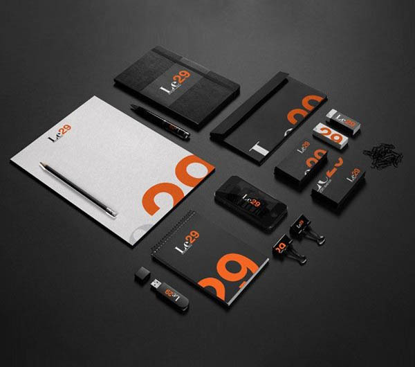
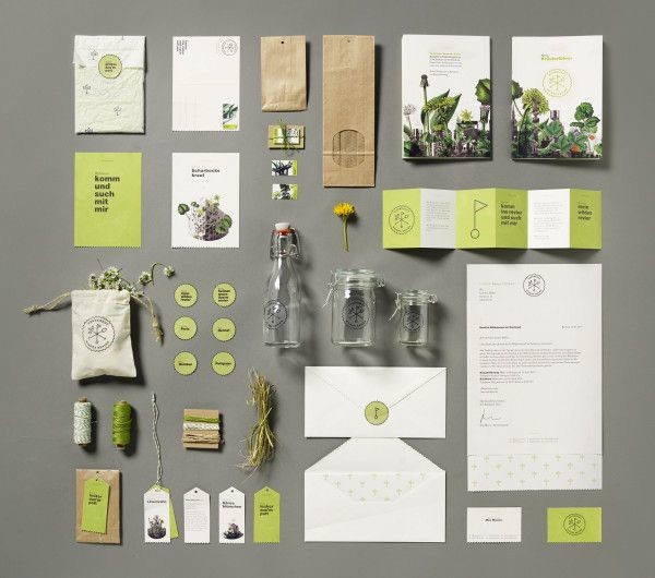
You would be carrying your brand everywhere. If your logo isn’t versatile it might look good only on certain merchandise thereby failing to serve its very purpose. Your logo should be comprehendible in all sizes, from a tiny favicon to larger than life hoarding. Mock-up on a variety of materials and backgrounds.
Apart from this, design your logo such that it doesn’t go stale in a short while. Your company logo should look trendy and lively even 20 years down the lane.
To sum-up, logos can subtly invoke an emotional response towards your brand, so, dwell deep and keep experimenting with various styles until you find one that stands out and strikes you.