Each colour conveys a different emotion and carries the ability to shape behaviours. Similarly, a combination of colours can reinforce an ideology. In the marketing arena too, this colour psychology plays a pivotal role in creating a brand perception. Therefore, the colour imperatives which guide consumer behaviour must be chosen carefully. Here’s a take on the best colour combinations for designing a logo.
In branding, colour is usually not used in isolation; instead, they are often combined to nail the brand message appropriately and effectively. However, choosing the right colour combination can become a daunting task, especially for small business owners, who are keen on conserving every resource available. So to simplify the cumbersome task of finding the right colour combination for your brand, we have deciphered logos of some great brands to help you understand how they have used a combination of colours to get their brand message out and clear.
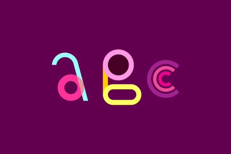
Both pink and purple are soft colours. While the pink appeals to women, the purple colour conveys the royalty or luxury of the brand. This fusion of pink and purple colour is great for cosmetics, perfume and lingerie brands.
White and Grey are connected colours; hence, their union reinforces the message given out by the accompanying colour. The purity and subtleness of white get reinstated by the grey. If your brand stresses purity or quality of your product above others, then this colour combination is right for you
Blue and orange colours fall on opposite sides of the colour wheel and thus form complementary colours. Though the orange used in this logo is not exactly an actual bright tint of orange, this subdued tint evokes the same feeling and creates a great colour combination with navy blue and light blue. The youthful spirit with the sportsman spirit is conveyed brilliantly through this combination of colours. This combination works great for Technology and Travel brands.
Giving it to nature! Taking the hues from the nature green & blue and using different tints of these colour has worked out well for this logo. This colour combination teaches us that inspiration can be drawn from a product or its source as well.
Adobe Photoshop mascot logo template
This colour combination is brilliant for gaming, and if black gets eliminated from the combination (using only white, purple and yellow), the mystery element will be taken out. As these colour s form high contrast, they can effectively make a logo stand out. However, caution should be exercised as it is a loud combination of colours.
While the grey here talks about the purity and reliability, the pastel shades of green reinstate the freshness of the product, and a touch of pink has made the overall logo an eye catcher. This colour scheme is also good for the brand into the baby food business.
Contrasting colours and a combination of loud and subdued colours invoke a feeling of ethnicity. This colour combination is useful if you trade in ethnic products.
Fresh, fresh, fresh!!! This lively combination of colours screams out the youthful and freshness of the brand. The use of contrasting marron red along with white adds a different dimension to its logo. This colour combination is apt if your brand represents a youthful spirit while staying responsible and grounded.
Each colour in this combination invokes a different emotion, but it is put together in such a thoughtful way that they drive down the message of being environmentally responsible effectively.
Use of subdued colours is apt if your logo is retro style. Also, this fantastic use of colours makes it playful and takes you to a different period.
This logo is an excellent example use of warm and cool colours together. Most of these colours are complementary colours. They have been placed together in different schemes – the hands form an analogous scheme (three nearby colours)